


Using Color Effectively in Whiteboard Animations
Beyond Black and White: How Strategic Color Use Can Elevate Your Whiteboard Animation's Message and Impact 🎨

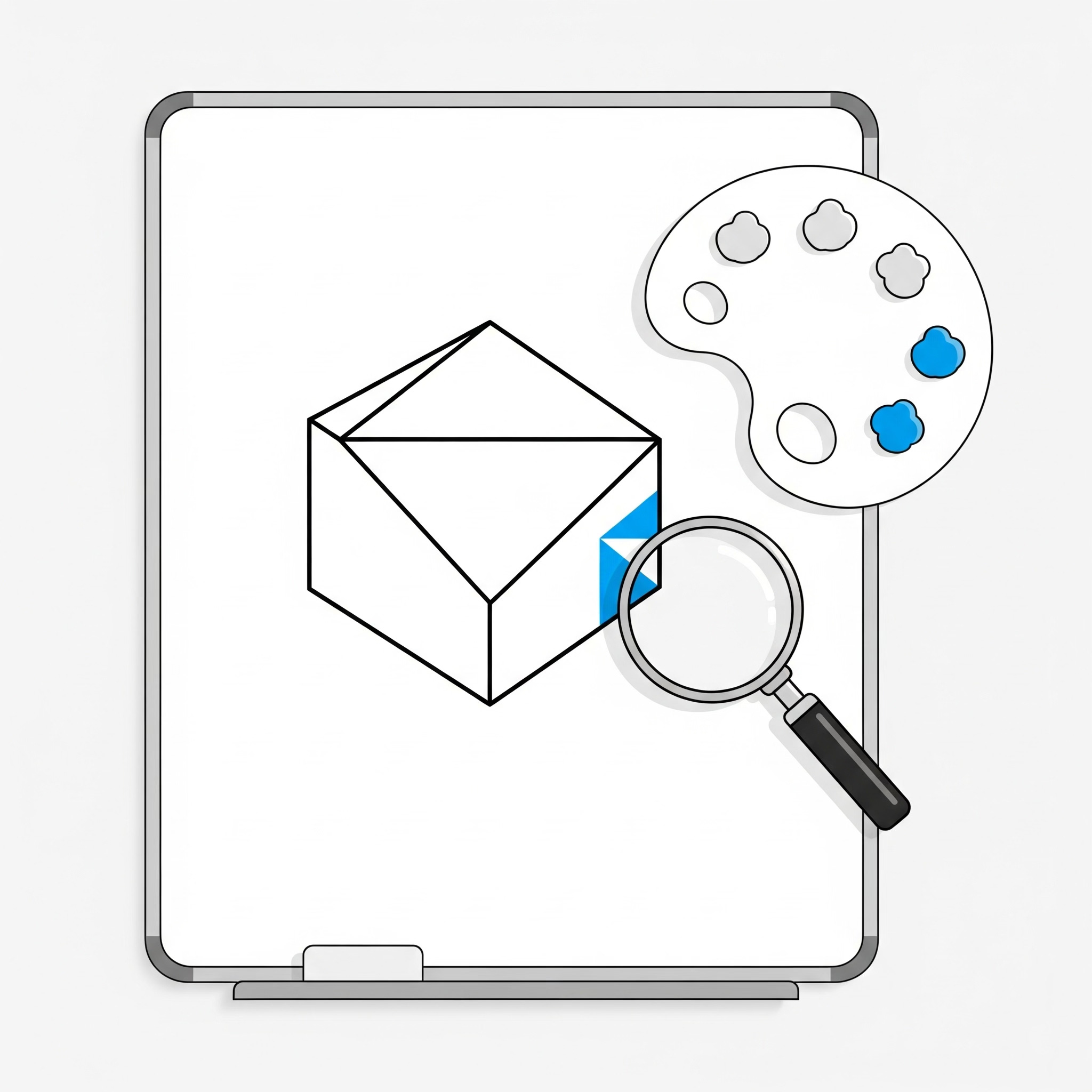
Whiteboard animations are renowned for their simplicity, often relying on black drawings on a white background. This minimalist approach is part of their charm and effectiveness, helping viewers focus on the evolving narrative. However, simply because it’s called "whiteboard" doesn't mean you're limited to a monochromatic palette. When used thoughtfully and strategically, color can become a powerful tool to enhance your whiteboard animation, guiding the viewer's eye, emphasizing key points, and even evoking specific emotions.
The key is not to overdo it. Too much color can disrupt the classic whiteboard aesthetic and overwhelm the viewer, defeating the purpose of its minimalist appeal. But with careful consideration, a splash of color can elevate your animation from simply informative to truly impactful and memorable. At Functioning Media, we understand that every element in your animation plays a role in effective communication. This guide will explore how to use color effectively in whiteboard animations, offering best practices to subtly enhance your message without losing the magic of the medium.
Why Strategic Color Use Matters in Whiteboard Animations 🤔
Color isn't just decorative; it's communicative. Here's why integrating it wisely can significantly boost your animation's effectiveness:
Highlights Key Information: Draws the viewer's eye to the most important elements, ensuring crucial points aren't missed.
Improves Understanding: Can be used to differentiate concepts, categories, or processes, making complex information easier to grasp.
Evokes Emotion: Different colors carry different psychological associations (e.g., red for urgency, green for growth, blue for trust), subtly influencing viewer perception.
Enhances Engagement: A well-placed pop of color can add visual interest and keep the animation dynamic without being distracting.
Reinforces Branding: Incorporating your brand colors consistently strengthens recognition and recall.
Directs Attention: Guides the viewer's focus along the narrative path, emphasizing the "next big thing."
Best Practices for Using Color Effectively in Whiteboard Animations 🎨✍️
The secret lies in restraint and purpose. Here's how to make color work for you:
1. Less is (Almost Always) More (The 1-3 Color Rule) 🌈
Best Practice: The power of whiteboard animation comes from its simplicity. Overuse of color can make it look messy and distract from the message.
How-To: Stick to a limited palette. Often, 1-3 accent colors are sufficient, in addition to the primary black (or dark grey) and white. Use these colors intentionally, not just because you can.
Tip: Think of color as a highlighter, not a coloring book.
2. Use Color for Emphasis and Focus 🎯
Best Practice: Reserve color for the most important elements, concepts, or calls to action.
How-To:
Highlight Keywords: Color specific words or phrases that represent your core message or unique selling proposition.
Emphasize Objects: Draw key products, services, or tools in color to make them stand out.
Draw Attention to CTAs: Your final call to action (e.g., "Visit Our Website," "Sign Up Now") should pop with color.
Example: In an animation about "cost savings," draw the dollar signs or the final reduced price in green.
3. Leverage Color for Differentiation and Grouping 📊
Best Practice: Use different colors to represent different categories, teams, stages in a process, or contrasting ideas.
How-To:
Process Flows: Use a specific color for each step in a sequence.
Comparison: If comparing two concepts, use a distinct color for each side of the comparison.
Data Representation: In simple graphs or charts, use color to differentiate segments or values.
Example: If explaining a 3-step process, make step 1 blue, step 2 green, and step 3 red.
4. Incorporate Your Brand Colors Strategically branding
Best Practice: Subtly weaving in your brand's primary or secondary colors reinforces brand identity without overwhelming the visual.
How-To:
Use your brand's main accent color for key elements, headlines, or your logo reveal.
Ensure the chosen colors are visually distinct enough from each other and the main black lines.
Tip: If your brand colors are very bright or numerous, select just one or two that work best with a minimalist aesthetic.
5. Consider Color Psychology and Emotion 💖
Best Practice: Understand the emotional associations of colors and use them to subtly influence your audience's feelings towards your message.
How-To:
Red: Urgency, importance, passion.
Blue: Trust, calm, stability, professionalism.
Green: Growth, nature, health, money.
Yellow: Optimism, cheerfulness, attention.
Orange: Enthusiasm, creativity.
Example: If your animation is about a sustainable product, green elements can reinforce the eco-friendly message.
6. Ensure Readability and Contrast 🖋️
Best Practice: Whatever colors you choose, ensure they provide sufficient contrast against the white background (and against black lines) to remain easily readable.
How-To: Avoid pastel colors that might be too faint. Test your color choices on various screens and lighting conditions.
Tip: Use online contrast checkers to ensure accessibility for all viewers.
7. Maintain a Dominant Black (or Dark Grey) for Outline and Detail ⚫
Best Practice: The primary drawing should almost always remain in black (or a very dark grey) to maintain the classic whiteboard look and allow color to truly pop as an accent.
How-To: Reserve black for character outlines, intricate details, and the majority of text.
Importance: This maintains the traditional aesthetic that makes whiteboard animations unique and effective.
8. Don't Just Use Color, Animate It! 💫
Best Practice: Consider how color appears during the drawing process. It can be a reveal.
How-To:
The outline is drawn in black, then the interior fills with color.
A black drawing is completed, and then a key element is "highlighted" by being colored in.
Example: Draw a lightbulb in black, then as the "idea" hits, the bulb quickly fills with yellow light.
Using color in your whiteboard animations is a subtle art. It's about enhancing, not overwhelming. By strategically applying a limited palette to emphasize key information, differentiate concepts, and align with your brand's message, you can create animations that are not only clear and informative but also visually engaging and deeply memorable.
Ready to add a splash of strategic color to your next animated explainer? Visit FunctioningMedia.com for expert whiteboard animation production and visual storytelling services, and subscribe to our newsletter for more creative content tips!
#WhiteboardAnimation #ColorTheory #VideoMarketing #VisualDesign #ContentStrategy #AnimationTips #GraphicDesign #ExplainerVideo #CreativeContent #FunctioningMedia