

Understanding Different Types of Website Navigation
Beyond the Menu: A Beginner's Guide to Website Navigation and Why It’s Key to a Great User Experience

Imagine walking into a physical store where the layout is confusing, the aisles are unlabeled, and you can't find the checkout counter. You'd likely leave and go somewhere else. The same principle applies to your website. Website navigation is the system of links, menus, and buttons that guides a user through your site's content. It's the blueprint of your digital storefront, and a well-designed navigation system is crucial for a positive user experience (UX) and a high-performing website.
Many website builders make the mistake of treating navigation as an afterthought, simply adding a standard menu without considering the user's journey. This oversight can lead to a confusing experience, high bounce rates, and a failure to convert visitors into customers. For anyone building a website, understanding the different types of navigation and their strategic purpose is a fundamental step toward creating a site that is intuitive, easy to use, and effective. This guide will walk you through the most common types of website navigation, explaining their strengths and best use cases so you can choose the right one for your site.
Why Navigation Is the Backbone of Your Website 🤔🔗
A well-planned navigation system is essential because it:
Improves User Experience (UX): It helps visitors find what they're looking for quickly and easily, leading to a satisfying experience.
Boosts SEO: A clear navigation structure helps search engines crawl and index your site more efficiently, which can lead to higher rankings.
Drives Conversions: By guiding users along a clear path, from a blog post to a product page to the checkout, navigation can directly influence your conversion rates.
Communicates Your Site's Structure: It gives visitors a mental model of your website's hierarchy and content, making the site feel organized and professional.
Common Types of Website Navigation 🗺️
Choosing the right navigation depends on your website's size, content, and purpose.
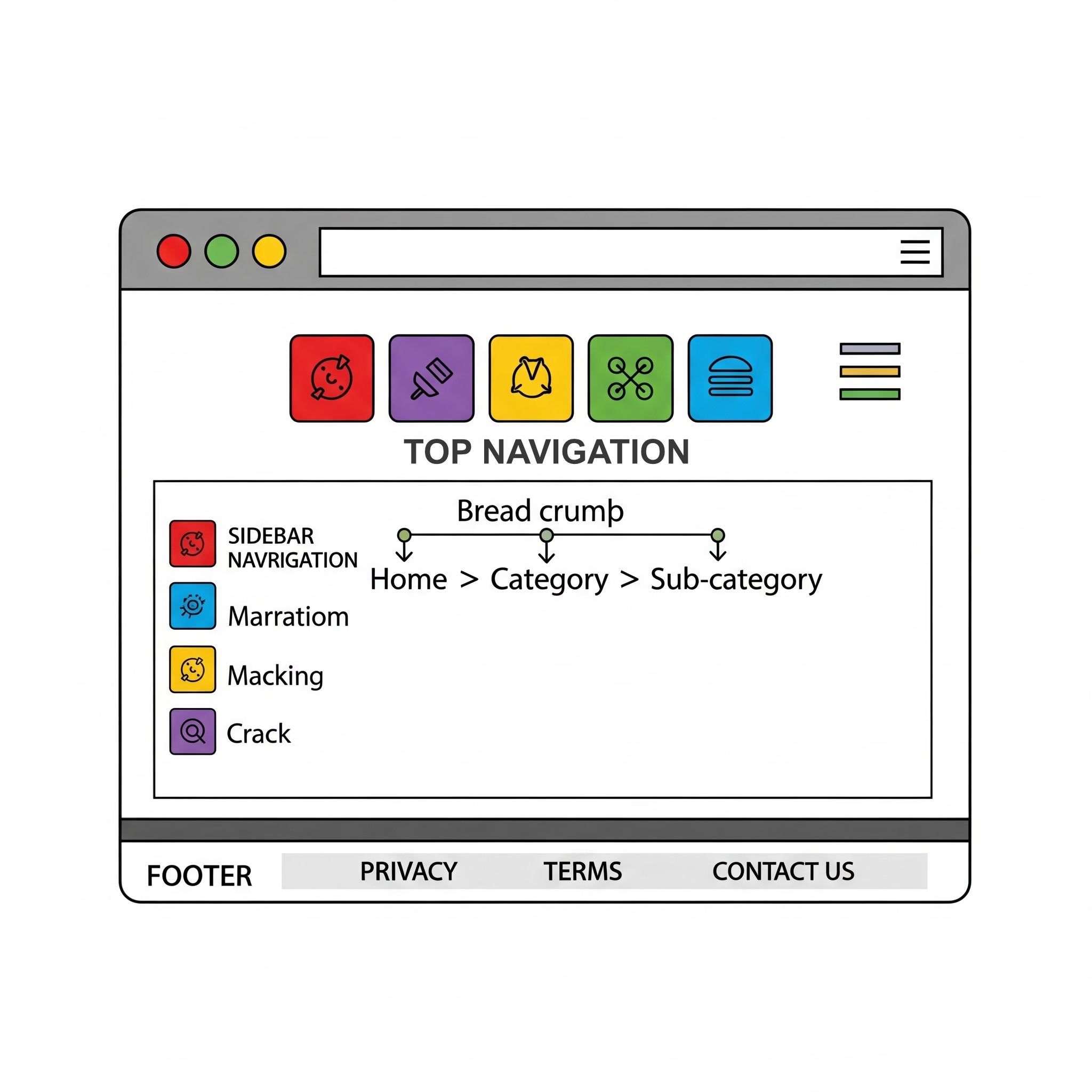
1. Top Navigation Bar (Horizontal Navigation) 💻
What it is: The most common type of navigation, it’s a horizontal bar of links placed prominently at the top of a webpage. It's often found on desktop sites and typically includes links to a site's main sections like "Home," "About Us," "Services," and "Contact."
Best for: Most websites, from small business sites and blogs to large e-commerce stores. It’s familiar, easy to find, and great for highlighting your most important pages.
Strengths: Highly visible, familiar to users, and works well for a limited number of top-level menu items.
Weaknesses: It can get cluttered if you have too many menu items.
2. Hamburger Menu 🍔
What it is: A small icon, usually three horizontal lines, that collapses your website's menu items. When a user clicks it, a full menu is revealed. It's a standard feature for mobile websites to save screen space.
Best for: Mobile websites and apps. It can also be used on desktop sites with extensive content to declutter the top navigation bar.
Strengths: Saves significant screen real estate, which is crucial for mobile devices. It keeps the design clean and minimalistic.
Weaknesses: It hides the navigation, requiring an extra click from the user. This can sometimes lead to lower engagement on desktop sites, where there is more room.
3. Sidebar Navigation (Vertical Navigation) ⬅️
What it is: A menu of links that runs vertically down the side of a webpage, typically on the left.
Best for: Web applications, dashboards, or websites with a deep hierarchy and many sub-pages. It's also common for blogs and news sites to feature categories in the sidebar.
Strengths: Excellent for complex sites with many pages or sub-categories. The vertical layout allows for a large number of links without cluttering the page.
Weaknesses: It takes up valuable horizontal screen space on desktop.
4. Footer Navigation ⬇️
What it is: A menu of links placed at the very bottom of a webpage. It’s often used for secondary, but important, information.
Best for: Providing access to pages that aren't critical to the main user journey but are still important, such as "Terms of Service," "Privacy Policy," "Careers," and social media links.
Strengths: It's a universal expectation that users know to look in the footer for this type of information. It doesn't distract from the primary navigation.
Weaknesses: Not suitable for primary navigation as it requires the user to scroll to the very bottom of the page.
5. Breadcrumb Navigation 🍞
What it is: A trail of links, usually found near the top of a page, that shows the user their current location within a website's hierarchy (e.g.,
Home > Products > Electronics > Laptops).Best for: Large, multi-level websites like e-commerce stores or informational sites.
Strengths: It helps users understand their location and easily navigate back to previous categories. It's a great secondary navigation tool that improves UX.
Weaknesses: It's not a replacement for primary navigation.
Best Practices for Choosing Your Navigation Style 🎯
Prioritize a mobile-first approach. Your navigation must be intuitive and easy to use on a small screen. The hamburger menu is a standard here.
Use a top navigation bar for your most important pages. This is where users expect to find your primary content.
Don't be afraid to mix and match. A large e-commerce site might use a top navigation bar for main categories, a sidebar for sub-categories, and a footer for legal information.
Always test your navigation. User testing can reveal if your navigation is intuitive or if it's causing confusion.
Understanding these different types of navigation is the first step toward building a website that is not just aesthetically pleasing but also functional, user-friendly, and optimized for success.
Is your website's navigation confusing your visitors? Visit FunctioningMedia.com for expert web design and UX services that help you create a clear, intuitive navigation system that guides users and drives conversions. Let's make your website a breeze to navigate!
#WebsiteNavigation #WebDesign #UXDesign #WebsiteBuilding #UserExperience #NavigationMenu #BeginnerGuide #WebDevelopment #BestPractices #FunctioningMedia