


The Role of Color Psychology in Website Design
Beyond aesthetics: Discover how strategic use of color in website design subtly influences emotions, drives user behavior, and builds powerful brand perceptions.

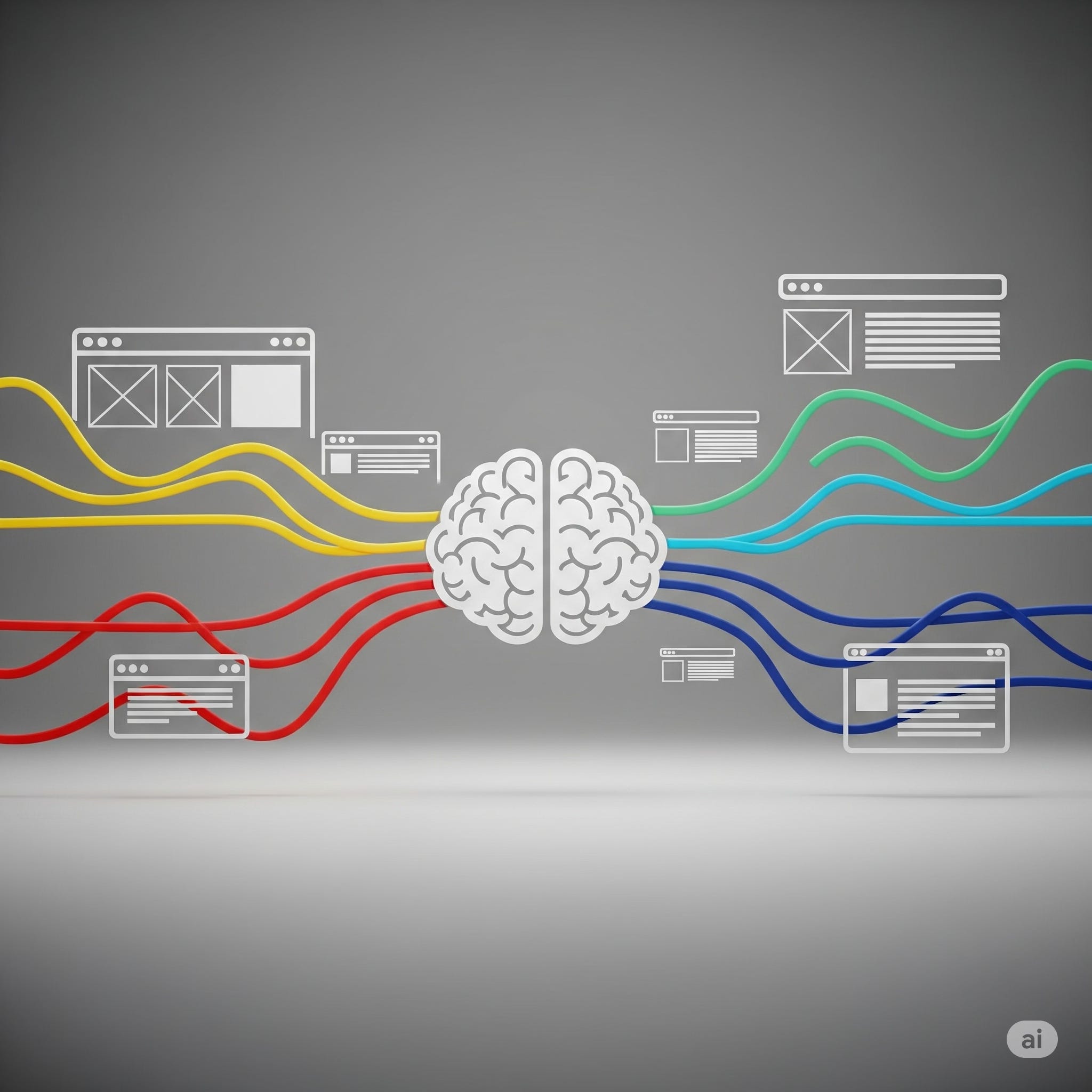
When you land on a website, what's one of the first things you notice? Often, it's the colors. Colors aren't just decorative; they're powerful communication tools that evoke emotions, convey messages, and even influence decisions.This is the essence of Color Psychology in Website Design – the study of how different colors affect human behavior and emotions in the context of a digital interface.
Understanding color psychology is crucial for effective website design, as it allows you to intentionally shape user experience, guide attention, and reinforce your brand's message without saying a single word. At Functioning Media, we meticulously consider color choices to craft websites that don't just look good, but also feel right and perform effectively. This guide will introduce you to the fascinating world of color psychology and its vital role in creating impactful web experiences.
Why Color Psychology is a Game-Changer in Web Design 🤔
Think about the difference between walking into a sterile, white hospital room and a cozy, warmly lit café. Your emotional response is vastly different, and color plays a huge role. In website design, color:
Evokes Emotion: Different colors trigger specific feelings (e.g., calm, excitement, trust).
Influences Behavior: Colors can draw attention to calls to action, indicate urgency, or convey security.
Communicates Brand Identity: Colors are often the first thing people associate with a brand, helping to establish its personality and values.
Enhances Readability & Usability: Proper color contrast improves readability and guides the user's eye.
Creates Visual Hierarchy: Directs users to the most important elements on a page.
Increases Conversion Rates: Strategically chosen colors for buttons and key elements can boost clicks and sales.
Understanding Key Colors and Their Psychological Meanings 🌈
While cultural differences can influence color perception, here's a general overview of common associations in Western contexts:
1. Blue (Trust, Stability, Calmness, Logic)
Associations: Serenity, peace, reliability, security, intelligence, professionalism, technology.
Common Uses: Corporate websites, finance, tech companies, healthcare, social media (Facebook, LinkedIn).
Caution: Too much blue can be seen as cold or impersonal.
2. Red (Energy, Passion, Urgency, Danger, Excitement)
Associations: Love, anger, intensity, warning, attention-grabbing, power, desire.
Common Uses: Calls to action ("Buy Now," "Sign Up"), sales banners, food (stimulates appetite), entertainment, sports.
Caution: Overuse can create aggression or overwhelm.
3. Green (Growth, Nature, Health, Freshness, Wealth)
Associations: Environment, sustainability, prosperity, renewal, harmony, peace, natural products.
Common Uses: Environmental companies, health and wellness, finance (money), outdoor brands.
Caution: Some shades can be associated with sickness or envy.
4. Yellow (Optimism, Cheerfulness, Warmth, Caution)
Associations: Happiness, joy, energy, creativity, attention, caution, warning.
Common Uses: Youth-oriented brands, travel, food, attention-grabbing elements.
Caution: Overuse can be irritating or overwhelming. Light yellow can be hard to read.
5. Orange (Enthusiasm, Creativity, Friendliness, Affordability)
Associations: Excitement, warmth, innovation, adventure, enthusiasm, accessibility.
Common Uses: E-commerce (calls to action), creative agencies, sports, children's products. Often a less aggressive alternative to red for CTAs.
Caution: Can sometimes appear cheap or childish if not used carefully.
6. Purple (Luxury, Royalty, Wisdom, Spirituality, Creativity)
Associations: Sophistication, imagination, mystery, wealth, fantasy, unique.
Common Uses: Luxury brands, creative industries, beauty products, spiritual services.
Caution: Darker shades can be moody; lighter shades can be perceived as feminine.
7. Black (Sophistication, Power, Mystery, Authority, Elegance)
Associations: Formal, sleek, strong, bold, modern, exclusive.
Common Uses: Luxury brands, fashion, high-tech, photography. Often used for text and contrast.
Caution: Too much black can feel oppressive or negative.
8. White (Purity, Simplicity, Cleanliness, Minimalism)
Associations: Freshness, innocence, virtue, clarity, spaciousness.
Common Uses: Backgrounds, minimalist designs, health, tech. Crucial for creating whitespace and readability.
Caution: Can feel sterile or bland if not balanced with other colors.
9. Gray (Neutrality, Balance, Formality, Sophistication)
Associations: Professionalism, practicality, timelessness, conservative.
Common Uses: Backgrounds, typography, corporate sites. Often used as a primary neutral.
Caution: Can be seen as dull or uninspiring if dominant.
Best Practices for Applying Color Psychology in Web Design 🎨✅
Understand Your Brand & Audience: Your brand's personality and your target audience's demographics (age, culture) should guide your color choices.
Establish a Primary Color: Choose one main color that dominates your design and reflects your core brand message.
Use Complementary & Accent Colors: Select a palette of 2-3 additional colors that work well with your primary color. Use accent colors sparingly to highlight important elements (like CTAs).
Consider Contrast for Readability: Ensure sufficient contrast between text and background colors for optimal readability, especially for accessibility (WCAG guidelines).
Leverage Call-to-Action (CTA) Button Colors: Often, a color that stands out from the rest of your site's palette (e.g., orange or green on a blue site) works best for CTAs, as it draws the eye.
Maintain Consistency: Use your chosen color palette consistently across your website and all marketing materials to build brand recognition.
Test and Iterate: Color preferences can be subjective. A/B test different color schemes or button colors to see what resonates best with your audience and drives conversions.
Don't Overdo It: Too many colors can make a site look messy and unprofessional. Stick to a well-defined palette.
At Functioning Media, we don't just pick colors; we strategically select them based on psychological principles, industry best practices, and your unique brand identity. Our goal is to create a website that not only looks stunning but also intelligently communicates your message, guides user behavior, and ultimately drives your business objectives.
Visit FunctioningMedia.com and subscribe to the newsletter.
#ColorPsychology #WebDesign #UXDesign #WebsiteBuilding #BrandIdentity #DesignTips #DigitalMarketing #EmotionalDesign #ColorTheory #FunctioningMedia