


The Importance of Mobile-Responsive Design in Today's Digital World
Your website needs to look great everywhere! Discover why mobile-responsive design is no longer an option, but a must-have for reaching your audience and boosting your online success. 📱💻

The Importance of Mobile-Responsive Design in Today's Digital World
Take a moment to look around you. How many people do you see looking at their smartphones or tablets? Chances are, quite a lot! In today's digital landscape, mobile devices aren't just an alternative way to access the internet; for many, they are the primary way. This seismic shift in user behavior means that if your website isn't optimized for mobile, you're missing out on a massive portion of your potential audience.
At Functioning Media, we emphasize that mobile-responsive design is the bedrock of modern website building. It's not merely a trend; it's a fundamental requirement for delivering a positive user experience and achieving your online goals. Let's explore why mobile responsiveness is so critically important today.
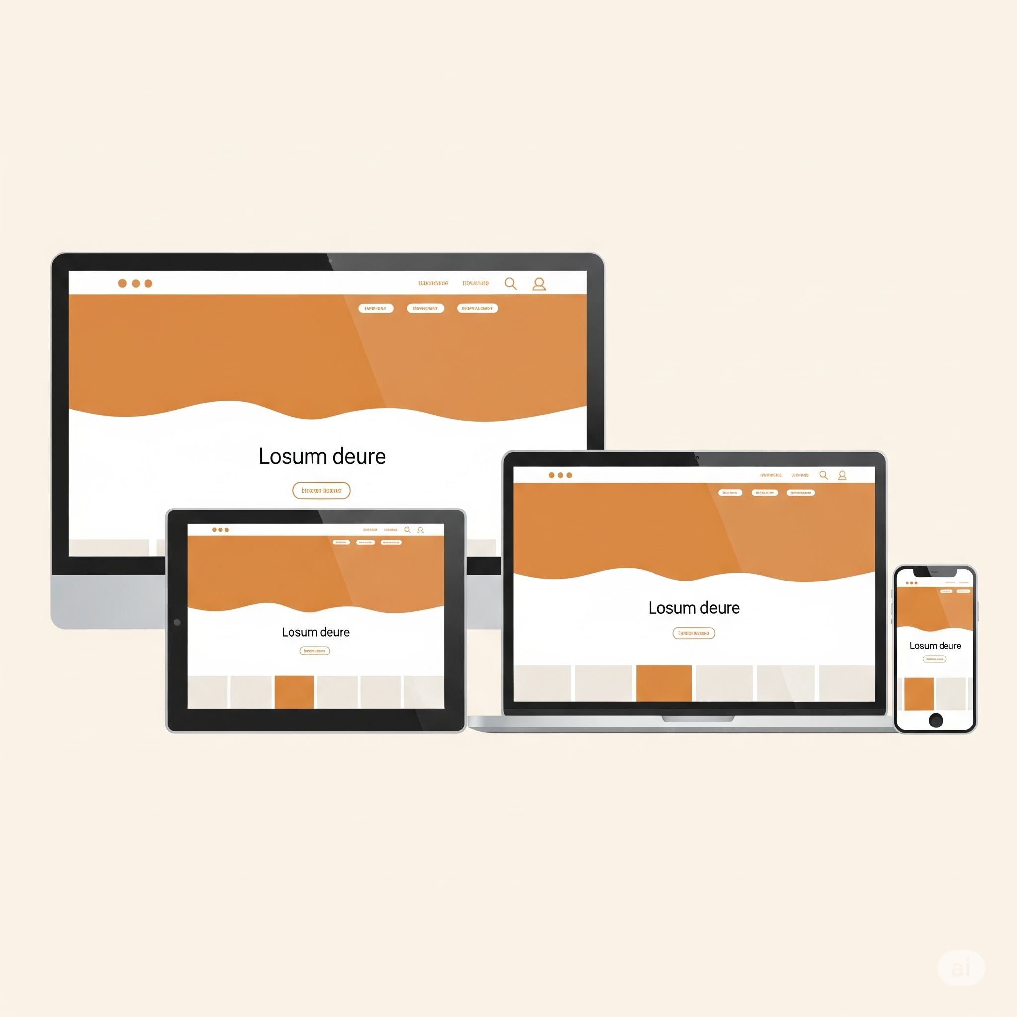
What is Mobile-Responsive Design? 🤔
Simply put, mobile-responsive design is an approach to web design that ensures your website's layout, content, and functionality automatically adjust and look great on any screen size – from a tiny smartphone to a large desktop monitor. It's about providing a seamless and intuitive experience, no matter how a user accesses your site. You don't need a separate "mobile version" of your site; it adapts intelligently.
Why Mobile-Responsive Design is Absolutely Essential Today: 🚀
1. Dominance of Mobile Traffic: The sheer volume of internet traffic coming from mobile devices is staggering and continues to grow. If your site isn't mobile-friendly, you're immediately alienating a huge segment of your audience, making it difficult for them to engage with your content or make purchases. 📈
2. Enhanced User Experience (UX): A website that's hard to navigate on a phone – with tiny text, cramped buttons, or horizontal scrolling – leads to frustration and a high bounce rate. A responsive design provides an intuitive, easy-to-use experience, keeping visitors happy and encouraging them to stay longer and explore more. 😊
3. Search Engine Rankings (SEO): Google, the world's leading search engine, uses mobile-friendliness as a significant ranking factor. Since 2015, Google has explicitly stated that mobile-friendliness impacts search rankings, especially for mobile searches. If your site isn't responsive, you're at a disadvantage in search results, making it harder for potential customers to find you. Google's "mobile-first indexing" means they primarily use the mobile version of your content for indexing and ranking. 📊
4. Increased Conversion Rates: Whether your goal is to generate leads, make sales, or encourage sign-ups, a seamless mobile experience is crucial. If users struggle to complete a form or navigate a checkout process on their phone, they'll abandon it. A responsive site removes these friction points, leading to higher conversion rates. 💰
5. Future-Proofing Your Website: The variety of screen sizes and devices will only continue to grow. A responsive design approach means your website is more adaptable to new technologies and devices as they emerge, reducing the need for constant redesigns. 🔮
6. Consistent Branding Across Devices: A responsive website ensures that your brand's look, feel, and message are consistent across all platforms, reinforcing your identity and professionalism. 🎨
7. Cost-Effectiveness and Easier Maintenance: Managing a single, responsive website is far more efficient and cost-effective than maintaining separate desktop and mobile versions. Updates and changes only need to be made once. 💸
How Functioning Media Prioritizes Mobile Responsiveness:
At Functioning Media, mobile-responsive design isn't an afterthought; it's integrated into every website we build from the ground up. We ensure that your website not only looks stunning on every device but also provides an optimal, fast, and user-friendly experience, no matter how your audience chooses to connect with you. Our goal is to build websites that perform flawlessly everywhere your customers are.
Visit functioningmedia.com and subscribe to the newsletter.
#MobileResponsive #WebDesign #UserExperience #UX #SEO #MobileFirst #WebsiteBuilding #DigitalStrategy #FunctioningMedia #OnlinePresence #Functioning #Media #FunctioningMedia