


The Impact of Visual Hierarchy on Website Usability
Guiding the Eye: How Visual Hierarchy Transforms Your Website from Clutter to Clarity and Boosts User Experience

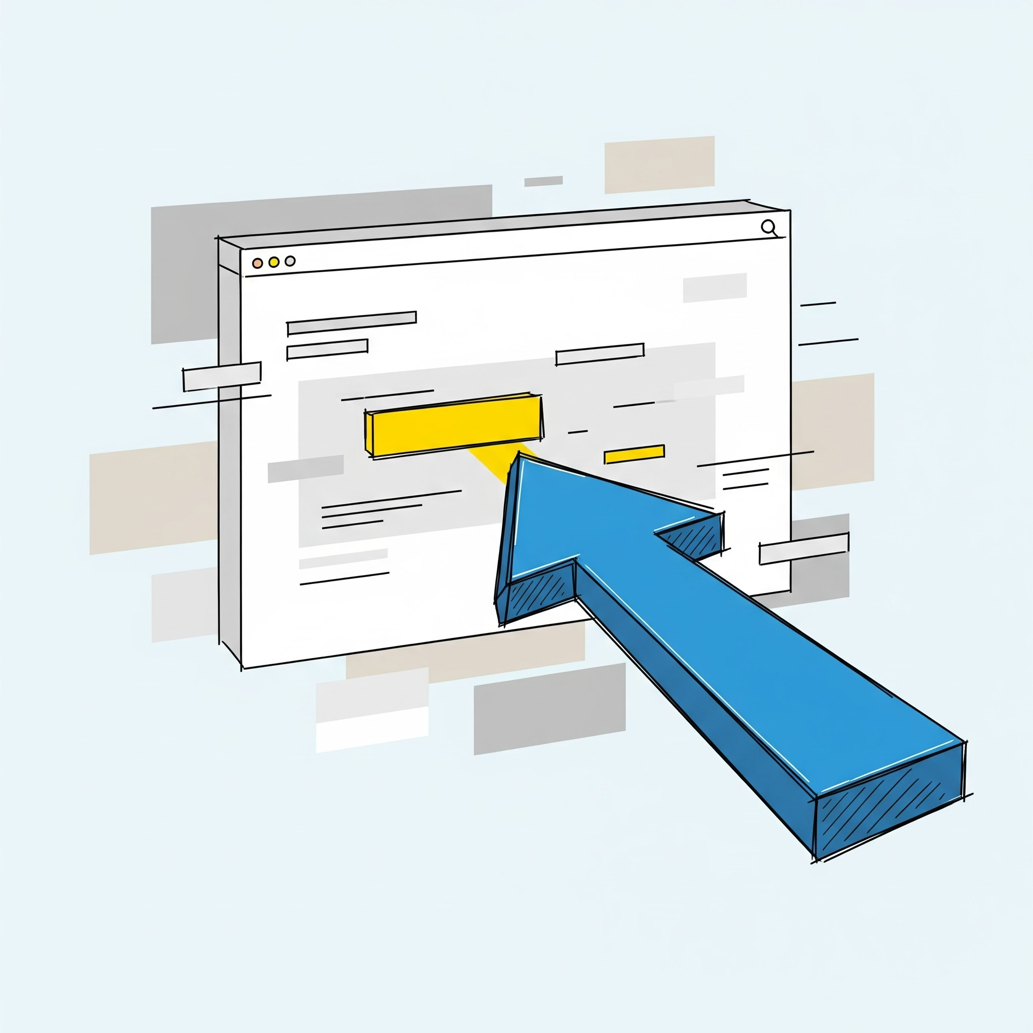
Imagine landing on a website where every element – every headline, image, button, and paragraph – screams for equal attention. It would be an overwhelming, confusing, and frustrating experience, right? This is where the unsung hero of web design, visual hierarchy, steps in. Visual hierarchy is the strategic arrangement and organization of elements on a webpage to guide the user's eye through the content in a specific, predetermined order of importance. It's about making sure the most crucial information or the desired action stands out immediately, while secondary information supports the primary message without causing distraction.
For anyone building or managing a website, understanding and implementing visual hierarchy is not just about making your site "look good"; it's fundamentally about making it work better. A well-executed visual hierarchy minimizes cognitive load, improves readability, facilitates navigation, and ultimately enhances the overall user experience (UX).Neglecting it can lead to high bounce rates, missed conversions, and a perception of unprofessionalism. At Functioning Media, we believe that intuitive design is the cornerstone of effective online presence. This guide will explore the profound impact of visual hierarchy on website usability, laying out the core principles and showing you how to apply them to create a seamless and effective user journey.
Why Visual Hierarchy is Indispensable for Website Usability 🤔
Visual hierarchy acts as an invisible guide for your users, offering numerous benefits:
Reduces Cognitive Load: By clearly prioritizing information, users don't have to waste mental energy figuring out what's important.
Improves Readability & Scanability: Users often scan rather than read. Hierarchy helps them quickly grasp the page's purpose and key takeaways.
Facilitates Navigation: It guides users to important links, menus, and calls-to-action (CTAs), making it easier to find what they need.
Enhances User Experience (UX): An intuitive, easy-to-navigate site leads to a more satisfying and efficient interaction.
Drives Conversions: By directing attention to CTAs and key value propositions, it increases the likelihood of desired actions (e.g., purchases, sign-ups).
Reinforces Brand Identity: Consistent application of hierarchy principles (e.g., specific font sizes for headers) strengthens brand recognition and professionalism.
Supports Content Consumption: It breaks down complex information into digestible chunks, encouraging users to engage deeper with your content.
Core Principles of Visual Hierarchy and Their Impact on Usability 🗺️✨
Visual hierarchy is achieved by manipulating various design elements to create a sense of importance and flow.
1. Size & Scale (The Biggest Draws the Eye) 📏
Principle: Larger elements naturally draw more attention and are perceived as more important.
Impact on Usability:
Immediate Focus: The main headline (H1) being the largest immediately tells users the page's core topic.
Prioritization: Key images, product displays, or hero banners are often larger to grab attention first.
Guidance: Progressively smaller text sizes (H2, H3, body text) help users scan and understand content structure quickly.
How-To Apply: Use larger font sizes for headlines, prominent dimensions for calls-to-action, and bigger images for featured content. Ensure a clear proportional difference between elements.
2. Color & Contrast (Pop and Distinction) 🌈
Principle: Bright, vibrant, or contrasting colors stand out more than muted or harmonious ones. High contrast improves readability.
Impact on Usability:
Attention Grabbing: A bright, contrasting call-to-action button immediately draws the eye, signaling interactivity.
Readability: High contrast between text and background (e.g., dark text on light background) is essential for legibility, reducing eye strain.
Grouping & Separation: Different color palettes can subtly group related sections or differentiate distinct elements.
How-To Apply: Use a limited, intentional color palette. Employ a strong accent color for interactive elements or high-priority information. Ensure sufficient contrast for all text.
3. Typography (The Voice of Your Text) 🅰️
Principle: Varying font styles, weights (bold/light), and sizes can create distinct levels of importance and readability.
Impact on Usability:
Scanning Aid: Clear headings (H1, H2, H3) with different sizes and weights allow users to quickly skim content and find relevant sections.
Readability: Legible font choices and appropriate line height/spacing improve comprehension.
Brand Voice: Typography contributes to the overall tone and personality of your website.
How-To Apply: Use a consistent typographic scale. Reserve the largest, boldest fonts for the most critical headlines. Use clear, readable fonts for body text.
4. White Space (The Unseen Power of Absence) ⬜
Principle: Negative space (empty areas) around elements creates visual breathing room, reducing clutter and drawing attention to what's left.
Impact on Usability:
Focus: Ample white space around a key element makes it stand out and appear more important.
Readability: It separates blocks of text and images, making content less overwhelming and easier to consume.
Clarity: Reduces visual noise, allowing users to concentrate on the essential elements.
How-To Apply: Don't be afraid of empty space. Use generous padding and margins around sections, images, and text blocks.
5. Proximity (Grouping Related Items) 📦
Principle: Elements that are physically close together are perceived as being related or belonging to a group.
Impact on Usability:
Logical Grouping: Information that belongs together (e.g., a product image, its name, price, and "Add to Cart" button) is grouped to show its relationship.
Reduced Confusion: Users intuitively understand that elements clustered together share a common purpose.
Streamlined Scanning: Related information can be processed as a single unit.
How-To Apply: Place related text, images, or buttons closer together. Use more space to separate unrelated sections.
6. Alignment (Order and Structure) ➡️
Principle: Arranging elements in a structured way (e.g., left, right, center alignment) creates visual order and neatness.
Impact on Usability:
Readability: Consistent text alignment (usually left-aligned for Western languages) is easier to read.
Professionalism: A well-aligned layout feels organized and trustworthy.
Predictable Flow: Creates a natural path for the eye to follow, improving navigation.
How-To Apply: Use grids and align elements consistently along horizontal and vertical axes. Avoid random placement.
7. Reading Patterns (Guiding the Natural Eye Path) 👀
Principle: Users tend to scan webpages in predictable patterns (e.g., F-pattern for text-heavy pages, Z-pattern for less text-heavy pages).
Impact on Usability:
Content Prioritization: Placing the most important information along these natural eye paths ensures it's seen.
Efficiency: Users can quickly find what they're looking for without extensive searching.
Conversion Optimization: CTAs placed strategically within these patterns are more likely to be noticed and clicked.
How-To Apply: Design your layout to leverage these patterns. Place primary information at the top-left (F-pattern) or along the "Z" path.
The impact of visual hierarchy on website usability cannot be overstated. It transforms a collection of elements into a coherent, navigable, and highly effective communication tool. By consciously applying principles of size, color, typography, white space, proximity, alignment, and understanding reading patterns, you empower your users to effortlessly engage with your content, find what they need, and complete desired actions. This attention to detail isn't just good design; it's smart business, directly contributing to higher user satisfaction, increased engagement, and improved conversion rates.
Is your website effectively guiding your users to what matters most? Visit FunctioningMedia.com for expert website design and UX/UI services that master visual hierarchy to create truly usable and high-converting websites. Let's design a powerful online experience for your audience!
#VisualHierarchy #WebsiteUsability #WebDesign #UXDesign #UIDesign #UserExperience #WebsiteBuilding #DesignPrinciples #CRO #DigitalMarketing #FunctioningMedia