Creating Effective Call-to-Action Buttons That Convert
The Power of the Click: Designing Call-to-Action Buttons That Compel and Convert
In the digital realm, every website and marketing campaign has a purpose: to guide users towards a desired action. Whether it's making a purchase, signing up for a newsletter, downloading an ebook, or contacting your sales team, these crucial steps are facilitated by one of the most vital elements of any user interface: the Call-to-Action (CTA) button. A well-designed and strategically placed CTA button is the bridge between a user's interest and their conversion into a lead, customer, or engaged subscriber.
However, many businesses underestimate the power of effective CTA buttons, treating them as mere afterthoughts. A poorly designed, bland, or unclear CTA can lead to missed opportunities, high bounce rates, and ultimately, a significant loss in conversions. It's not just about saying "Click Here"; it's about compelling a user to take the next step through persuasive copy, strategic placement, and visually appealing design. For website owners, marketers, UX designers, and content creators, mastering the art of creating high-converting CTA buttons is fundamental to achieving online success. At Functioning Media, we believe that every click should count. This guide will delve into the best practices and how-to strategies for creating effective call-to-action buttons that not only stand out but consistently drive conversions.
Why Effective CTA Buttons Are Your Conversion Powerhouse 🤔💰
The impact of well-crafted CTAs is profound:
Directly Drive Conversions: They are the literal gateways to your business goals (sales, leads, sign-ups).
Guide User Journey: They tell users exactly what to do next, eliminating confusion.
Improve User Experience (UX): Clear CTAs make websites intuitive and easy to navigate.
Boost Engagement: Compelling language can create a sense of urgency or benefit, encouraging interaction.
Enhance Brand Performance: Higher conversion rates mean better ROI on traffic and marketing spend.
Provide Measurable Data: Easily trackable clicks allow for optimization and A/B testing.
Reduce Friction: A prominent, clear CTA removes obstacles to action.
Best Practices & How-To for Creating Effective Call-to-Action Buttons That Convert 👆💡🚀
Crafting high-converting CTA buttons is a blend of psychology, design, and continuous optimization.
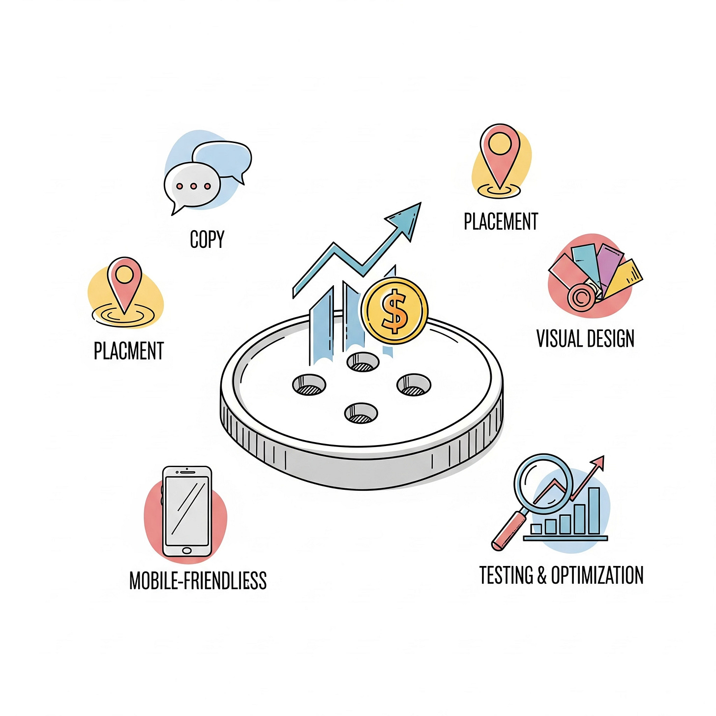
I. Compelling Copy (Tell Them What They Get, Not Just What They Do) 📝
Best Practice: Go beyond generic commands. Focus on the value or benefit the user will receive.
How-To:
Focus on Benefits: Instead of "Submit," try "Get Your Free Ebook," "Start Your 30-Day Trial," "Unlock Exclusive Content," "Find Your Dream Home."
Use Action-Oriented Verbs: "Discover," "Explore," "Join," "Grab," "Download," "Start," "Learn," "Shop," "Build," "Create."
Create Urgency/Scarcity (When Appropriate): "Limited Spots Left," "Claim Your Discount Now," "Ends Tonight!" Use sparingly to maintain credibility.
Keep it Concise: Ideally 2-5 words. Clear and to the point.
Personalize (If Possible): "Get My Free Guide," "Create My Account" can sometimes increase relevance.
Why it matters: Copy that speaks to the user's desire or solves a problem is far more persuasive.
II. Strategic Placement (Visibility is Key) 📍
Best Practice: Place CTAs where they are easily visible and logically fit within the user's journey.
How-To:
Above the Fold: For critical actions, place a primary CTA where users don't have to scroll to see it.
Logical Flow: Place CTAs naturally within your content. If you're discussing a feature, the CTA to "Learn More" or "Try It" should be near that discussion.
Multiple Placements (Judiciously): On long pages, repeat your CTA at various points (e.g., top, middle, bottom) but avoid overwhelming the user.
"Sticky" CTAs: Consider a sticky bar or floating button for key actions on long-scrolling pages.
Avoid Clutter: Don't surround your CTA with too many other distracting elements. Give it room to breathe.
Why it matters: Even the best CTA won't convert if users can't find it or don't see it at the right moment.
III. Visual Design & Contrast (Make it Stand Out) 🎨✨
Best Practice: Your CTA button should immediately draw the eye and differentiate itself from other page elements.
How-To:
Contrasting Colors: Use a color that stands out from your background and surrounding elements, but still aligns with your brand. Avoid using primary brand colors if they blend in too much. (e.g., if your brand is mostly blue, use a contrasting orange or green for CTAs).
Size Matters: Make the button large enough to be easily clickable, especially on mobile, but not so large that it dominates the page.
White Space: Give the button enough padding and surrounding white space to make it pop.
Shape: Rounded corners often feel more inviting and clickable than sharp rectangles.
Hover Effects: Implement subtle hover animations (e.g., color change, slight glow, subtle grow) to provide visual feedback and encourage interaction.
Icons (Sparingly): A small, relevant icon (e.g., a download arrow, a shopping cart) can reinforce the message, but don't clutter the button.
Why it matters: Visual prominence signals importance and draws the user's eye to the desired action.
IV. Mobile-Friendliness (Optimized for Every Device) 📱👍
Best Practice: Ensure your CTA buttons are perfectly usable and visible on all screen sizes.
How-To:
Finger-Friendly Size: Buttons should be large enough to be easily tapped with a thumb (Google recommends at least 48x48 device-independent pixels).
Sufficient Spacing: Ensure adequate space between multiple buttons to prevent accidental clicks.
Responsive Design: Buttons should scale and adjust their layout gracefully on different devices.
Text Readability: Ensure the text on the button is legible on small screens.
Avoid Overlaps: Buttons should not overlap with other interactive elements.
Why it matters: A significant portion of web traffic comes from mobile. A poor mobile CTA experience means lost conversions.
V. Testing and Optimization (The Path to Higher Conversions) 📊🔄
Best Practice: Never assume your CTA is perfect. Continuously test different variations to maximize performance.
How-To:
A/B Testing: This is crucial. Test different:
Copy: "Learn More" vs. "Get My Free Guide"
Colors: Red vs. Green
Placement: Above fold vs. middle of page
Size/Shape: Larger vs. smaller, rounded vs. square
Microcopy: Small text near the button providing extra context or reassurance.
Heatmaps & Session Recordings: Use tools like Hotjar or Crazy Egg to see where users click (or don't click) and how they interact with your page.
Monitor Metrics: Track click-through rates (CTR) and conversion rates for your CTAs in Google Analytics or your marketing platform.
Iterate: Use insights from your testing to make data-driven improvements.
Why it matters: Continuous testing is the only way to truly understand what resonates with your audience and drives the highest conversion rates.
An effective call-to-action button is far more than just a hyperlink; it's a strategically crafted element designed to motivate and guide your users towards valuable interactions. By focusing on compelling copy that emphasizes benefits, strategic placement for maximum visibility, a visually striking design, mobile optimization, and continuous A/B testing, you can transform your CTA buttons from passive elements into powerful conversion engines that directly contribute to your business's success.
Are your website buttons missing the mark on conversions? Visit FunctioningMedia.com for expert website design and conversion rate optimization (CRO) services that transform your call-to-action buttons into conversion powerhouses. Let's make every click count for your business!
#CTADesign #CallToAction #ConversionRateOptimization #CRO #WebsiteDesign #UXDesign #DigitalMarketing #WebDevelopment #MarketingStrategy #FunctioningMedia


